Home >>CSS Tutorial >CSS 2D Transforms
CSS 2D Transforms
CSS 2D Transforms
The CSS transformation allow you to modify an element by its size, shape and position. It allow you to move, scale, rotate, and skew elements along with the X-axis and Y-axis.
These are the types of Transformation:
- translate()
- rotate()
- scale()
- skewX()
- skewY()
- matrix()
translate() Method
The translate() method is used to move an element from its current position X-axis and Y-axis.
Let's take an example of translate() method:
<!DOCTYPE html>
<html>
<head>
<style>
div.txt {
  width: 300px;
  height: 100px;
  background-color: #65d0eb;
  border: 1px solid black;
  -ms-transform: translate(30px,70px); /* IE 9 */
  -webkit-transform: translate(30px,70px); /* Safari prior 9.0 */
  transform: translate(30px,70px); /* Standard syntax */
}
</style>
</head>
<body>
<h1>translate() Method</h1>
<p>Translate() method moves an element from its current position:</p>
<div class="txt">This div element is moved 60 pixels to the right, and 110 pixels down from its current position.</div>
</body>
</html>
translate() Method
Translate() method moves an element from its current position:
rotate() Method
The rotate() method rotates an element clockwise or counter-clockwise according to a given degree (The degree is given in the parenthesis).
Let's take a example of rotate() method:
<!DOCTYPE html>
<html>
<head>
<style>
div {
    width: 300px;
    height: 100px;
    background-color: #65d0eb;
    border: 1px solid black;
}
div#rotate {
    -ms-transform: rotate(25deg); /* IE 9 */
    -webkit-transform: rotate(25deg); /* Safari */
    transform: rotate(25deg); /* Standard syntax */
}
</style>
</head>
<body>
<div>
This a normal div element.
</div>
<div id="rotate">
This is the 25 degree clockwise rotated div element by using rotate() method.
</div>
</body>
</html>

scale() Method
The scale () method is used to decrease or increase the size of an element as per the parameter given for the width and height.
Let's take an example of scale() method:
<!DOCTYPE html>
<html>
<head>
<style>
div.scale {
    margin: 150px;
    width: 200px;
    height: 100px;
    background-color: #65d0eb;
    border: 1px solid black;
    border: 1px solid black;
    -ms-transform: scale(2.3,2); /* IE 9 */
    -webkit-transform: scale(2.3,2); /* Safari */
    transform: scale(2.3,2); /* Standard syntax */
}
</style>
</head>
<body>
<div class="scale">
This div element is scaled 2.3 times of its original width, and 2 times of its original height.
</div>
</body>
</html>
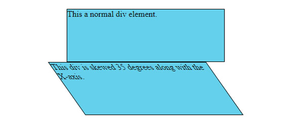
skewX() Method
The skewX() method is generally used In order to skew an element along side the X-axis by the provided angle.
Let's take an example of skew() method:
<!DOCTYPE html>
<html>
<head>
<style>
div {
    width: 300px;
    height: 100px;
    background-color: #65d0eb;
    border: 1px solid black;
}
div#skewX {
    -ms-transform: skewX(35deg); /* IE 9 */
    -webkit-transform: skewX(35deg); /* Safari */
    transform: skewX(35deg); /* Standard syntax */
}
</style>
</head>
<body>
<div>This a normal div element.</div>
<div id="skewX">
This div is skewed 35 degrees along with the X-axis.
</div>
</body>
</html>
skewY() Method
The skewY() method is generally used In order to skew an element along side the Y-axis by the provided angle.
Let's take an example of skewY() method:
<!DOCTYPE html>
<html>
<head>
<style>
div {
    width: 300px;
    height: 100px;
    background-color: #65d0eb;
    border: 1px solid black;
}
div#skewY {
    -ms-transform: skewY(35deg); /* IE 9 */
    -webkit-transform: skewY(35deg); /* Safari */
    transform: skewY(35eg); /* Standard syntax */
}
</style>
</head>
<body>
<div>
This a normal div element.
</div>
<div id="skewY">
This div is skewed 35 degrees along with the Y-axis.
</div>
</body>
</html>

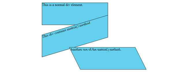
matrix() Method
The matrix() method combines all the 2D method into a single property. The matrix transform property take six parameter which allows you to rotate, translate (move), scale, and skew elements.
Let's take an example of matrix() method:
<!DOCTYPE html>
<html>
<head>
<style>
div {
    width: 300px;
    height: 100px;
    background-color: #65d0eb;
    border: 1px solid black;
}
div#matrix1 {
    -ms-transform: matrix(1, -0.3, 0, 1, 0, 0); /* IE 9 */
    -webkit-transform: matrix(1, -0.3, 0, 1, 0, 0); /* Safari */
    transform: matrix(1, -0.3, 0, 1, 0, 0); /* Standard syntax */
}
div#matrix2 {
    -ms-transform: matrix(1, 0, 0.5, 1, 150, 0); /* IE 9 */
    -webkit-transform: matrix(1, 0, 0.5, 1, 150, 0); /* Safari */
    transform: matrix(1, 0, 0.5, 1, 150, 0); /* Standard syntax */
}
</style>
</head>
<body>
<p>The matrix() method combines all the 2D transform methods into single property.</p>
<div>
This  is a normal div element.
</div>
<div id="matrix1">
This div contains matrix() method.
</div>
<div id="matrix2">
Another use of the matrix() method.
</div>
</body>
</html>